Discussion
Loading...

Post

Log in
  • About
  • Code of conduct
  • Privacy
  • About Bonfire
Khaled Hosny
Khaled Hosny
@khaled@typo.social  ·  activity timestamp 2 days ago

I started working on #LibreOffice again, two new developments:

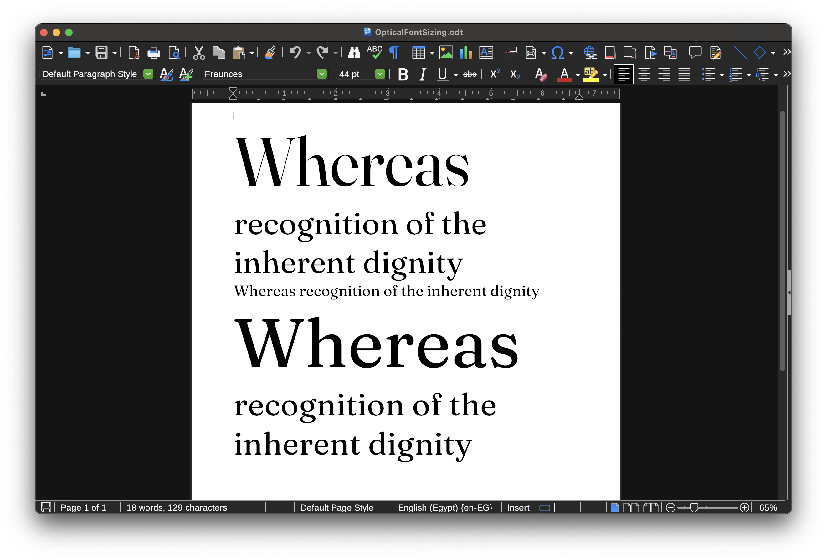
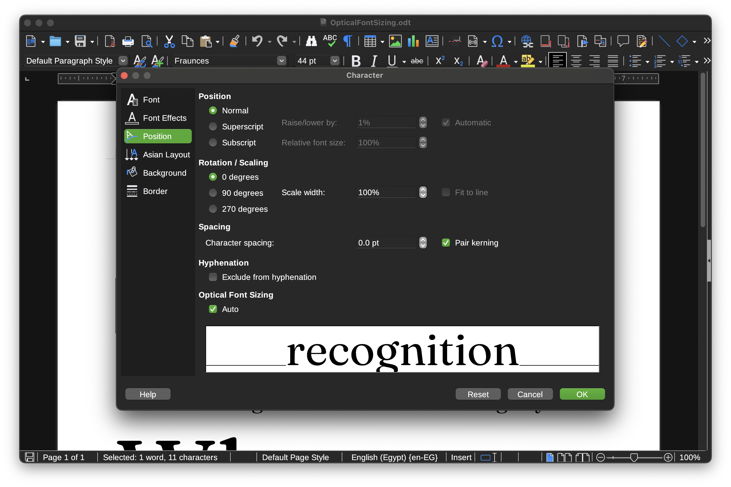
It now instances variable fonts when embedding in PDF instead of drawing the outlines as PDF vectors (using PDF Type 3 fonts), which is more efficient and allows the text to be rendered as fonts not graphics.

This uses #HarfBuzz subsetter under the hood, so while at it, I replaced most of LibreOffice’s ancient (CVE-happy) low-level font subsetting code, with HarfBuzz subsetter.

CFF2 fonts are still drawn as graphics, but next of version of HarfBuzz will support downgrading CFF2 to CFF after instancing, and I plan to use that when it is available.

  • Copy link
  • Flag this post
  • Block
Khaled Hosny
Khaled Hosny
@khaled@typo.social  ·  activity timestamp 2 days ago

The other development, is that #LibreOffice now supports automatically enabling optical size axis (opsz).

More in: https://bugs.documentfoundation.org/show_bug.cgi?id=153368#c9

This also sets up some infrastructure for supporting arbitrary font variation settings (so fare LibreOffice only supported named instances), which I would like to tackle next.

Support for named instances is a bit of a mess at moment as well because LibreOffice never properly supported font styles outside weight/slop, but I have some ideas to sort this out at some point.

2 media
Test document that uses https://fonts.google.com/specimen/Fraunces, with above text enabling Font Optical sizing, and below text disabling it. Notice how the above text gets more thinner strokes as the font size increases and some letters (like h, n, and s) change there shape compared to the smallest point size.
Screenshot of the Character dialog

153368 – Support optical size for OpenType variable fonts

  • Copy link
  • Flag this comment
  • Block

BT Free Social

BT Free is a non-profit organization founded by @ozoned@btfree.social . It's goal is for digital privacy rights, advocacy and consulting. This goal will be attained by hosting open platforms to allow others to seamlessly join the Fediverse on moderated instances or by helping others join the Fediverse.

BT Free Social: About · Code of conduct · Privacy ·
Bonfire social · 1.0.2-alpha.34 no JS en
Automatic federation enabled
Log in
Instance logo
  • Explore
  • About
  • Code of Conduct